

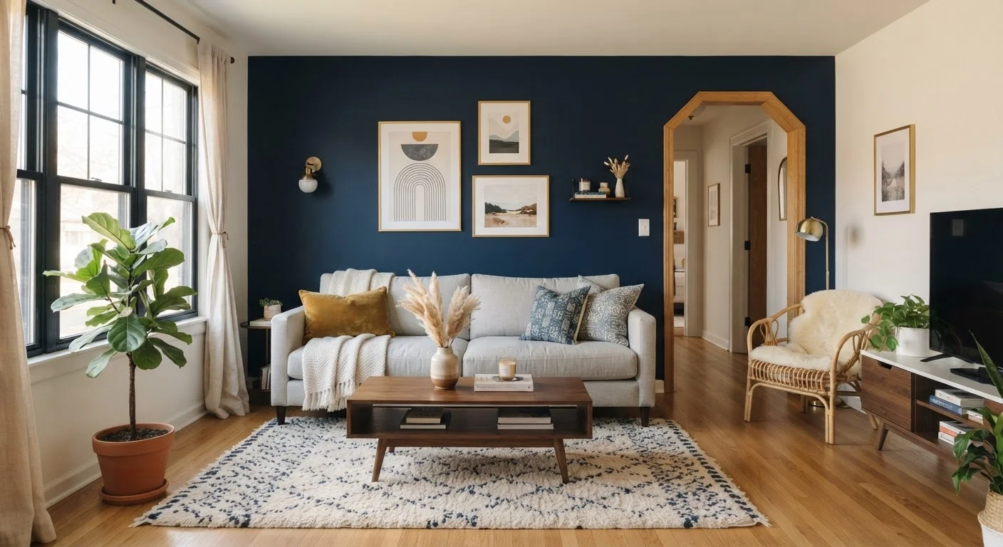
Our Verdict
Accent walls are a genuinely useful decorating tool — but only when the room's layout, proportions, and lighting support them. Applied to the right wall with a color or texture that complements the rest of the space, they add depth, personality, and structure. Applied carelessly, they fragment a room and make it harder, not easier, to furnish and style.
Accent walls are best suited to homeowners and renters who want to add character to a defined space — particularly bedrooms, living rooms with a clear focal point, or dining areas — without committing to a full room repaint.
What an Accent Wall Is Actually Supposed to Do
An accent wall is a single wall in a room treated differently from the others — through paint color, wallpaper, paneling, tile, or texture — to create visual emphasis. The underlying logic is sound: every well-composed room benefits from a focal point, and an accent wall is one way to establish one deliberately.
The trouble is that creating emphasis and creating contrast are not the same thing. A bright or heavily patterned wall creates contrast regardless of where it sits. Emphasis, on the other hand, requires placement: the wall you treat should already be the wall the eye naturally travels to when entering the room. When these two things align — strong treatment on a naturally prominent wall — the result feels intentional and grounded. When they don't, the room feels restless and harder to style.
Before committing to an accent wall, it helps to check whether the room already has underlying balance issues that the accent wall might amplify rather than solve.
When Accent Walls Work Well
Accent walls earn their place in a room when several conditions are present simultaneously.
Creates a clear focal point in rooms that lack one
A well-placed accent wall gives the eye somewhere to land, which makes furnishing the rest of the room more straightforward — you're arranging around an established anchor rather than trying to create one with furniture alone.
Adds depth and dimension without full repaint
Treating one wall lets you introduce a richer or bolder color than you'd be comfortable living with on all four walls, while keeping the overall room feeling open and balanced.
Cost-effective way to significantly alter a room's character
A single wall requires less paint, wallpaper, or material than treating the entire room, making it one of the more budget-accessible decorating updates available.
Can visually correct proportional imbalances
Darkening a far wall in a long, narrow room can make it appear to advance slightly, reducing the tunnel effect. Used carefully, this is a legitimate and practical application of accent wall logic.
Offers a low-stakes opportunity to test bold design choices
If you've been curious about a deep, saturated color or a dramatic wallpaper pattern, applying it to one wall lets you live with the effect before committing to it more broadly.
The strongest candidates for accent wall treatment share a common trait: the wall already anchors something meaningful. The wall behind a bed in a bedroom, the wall a fireplace sits against in a living room, or the wall facing the entry point of a dining room are all walls the eye lands on naturally. Reinforcing that hierarchy with color or texture feels cohesive because it follows the room's existing logic rather than fighting it.
Room proportions also matter. Taller rooms with ceilings above nine feet can absorb deeper colors and bold patterns more easily than low-ceilinged spaces, where the same treatment can feel oppressive. Rooms with generous natural light give you more latitude with saturated colors; darker rooms call for more restraint.
When Accent Walls Overwhelm a Space
The cons of accent walls are worth understanding clearly — not to discourage the approach, but to avoid the specific conditions that reliably backfire.
Wrong wall choice fragments the room visually
An accent wall on a non-focal wall — particularly one with a door or window breaking it up — creates contrast without emphasis, which reads as visual noise rather than intentional design.
Can make small rooms feel noticeably smaller
High-contrast colors on one wall in a compact room tend to advance rather than recede, reducing the perceived square footage and making the space feel more enclosed than it actually is.
Difficult to furnish around if color is poorly matched
A wall color chosen without reference to existing furnishings, flooring, or natural light can make the surrounding pieces look out of place, creating a decorating problem that requires further investment to solve.
Trendy treatments can date a room quickly
Certain wallpaper patterns and bold paint shades cycle in and out of fashion relatively quickly; an accent wall is more visible than a throw pillow, making it harder to simply swap out when tastes shift.
Competes with existing architectural features if poorly placed
In a room with crown molding, built-ins, or other detailed millwork, a strongly contrasting wall can draw attention away from those features rather than complementing them, creating a room that feels visually divided.
Small rooms are the most common casualties. In a room under roughly 120 square feet, a strongly contrasting wall doesn't recede — it advances, making the space feel smaller and more enclosed. The same applies to narrow rooms, where an accent wall on a short end can inadvertently make the tunnel effect worse.
Walls that contain doors, multiple windows, or changes in plane — like a wall that jogs or meets an angled ceiling — are also poor candidates. The architectural interruptions break up the treatment and undercut the visual impact you're trying to achieve. If you're decorating a tight space, small-space decorating principles generally favor approaches that unify surfaces rather than contrast them.
Renters: Know Your Lease Before You Paint
Many rental agreements restrict painting or require walls to be returned to their original color before move-out. Before treating any wall, review your lease and check with your landlord. Peel-and-stick wallpaper and removable fabric panels are renter-friendly alternatives that can achieve a similar effect without permanent changes — though their durability and ease of removal vary by product and surface type.
Choosing the Right Treatment
Paint is the most accessible accent wall option and the easiest to reverse, but it isn't the only one. Wallpaper — particularly textured or mural styles — can add dimension that flat paint cannot. Shiplap, board-and-batten, and other applied paneling create depth through shadow rather than color, which makes them more forgiving in rooms where strong color would dominate.
60–30–10
Classic interior color distribution ratio
Interior designers commonly reference the 60-30-10 rule — 60% dominant color, 30% secondary, 10% accent — as a proportional guide to color balance in a room.
1 wall
Maximum recommended accent treatment per room
Design guidance consistently suggests limiting bold treatment to a single wall per space; treating two or more accent walls typically creates competing focal points rather than emphasis.
Whichever treatment you choose, the relationship to the rest of the room's palette matters more than the treatment itself. An accent color pulled from an existing rug, artwork, or upholstery fabric tends to feel integrated. A color chosen in isolation — because it looked good on a swatch or a social media post — frequently clashes once it's surrounded by the room's actual furnishings and light. For rooms where lighting is already layered and considered, how ambient and accent lighting interact with wall color is worth factoring in early, not as an afterthought.
It's also worth questioning whether an accent wall is the right tool at all. Decorating conventions that seem like rules sometimes lead people toward accent walls as a default solution when other approaches — layered textiles, strategic furniture placement, or artwork groupings — might achieve the same focal-point effect with less risk.
The content on this site is for informational purposes only and is not a substitute for professional advice. Always consult a qualified professional for guidance specific to your situation.