

Our Verdict
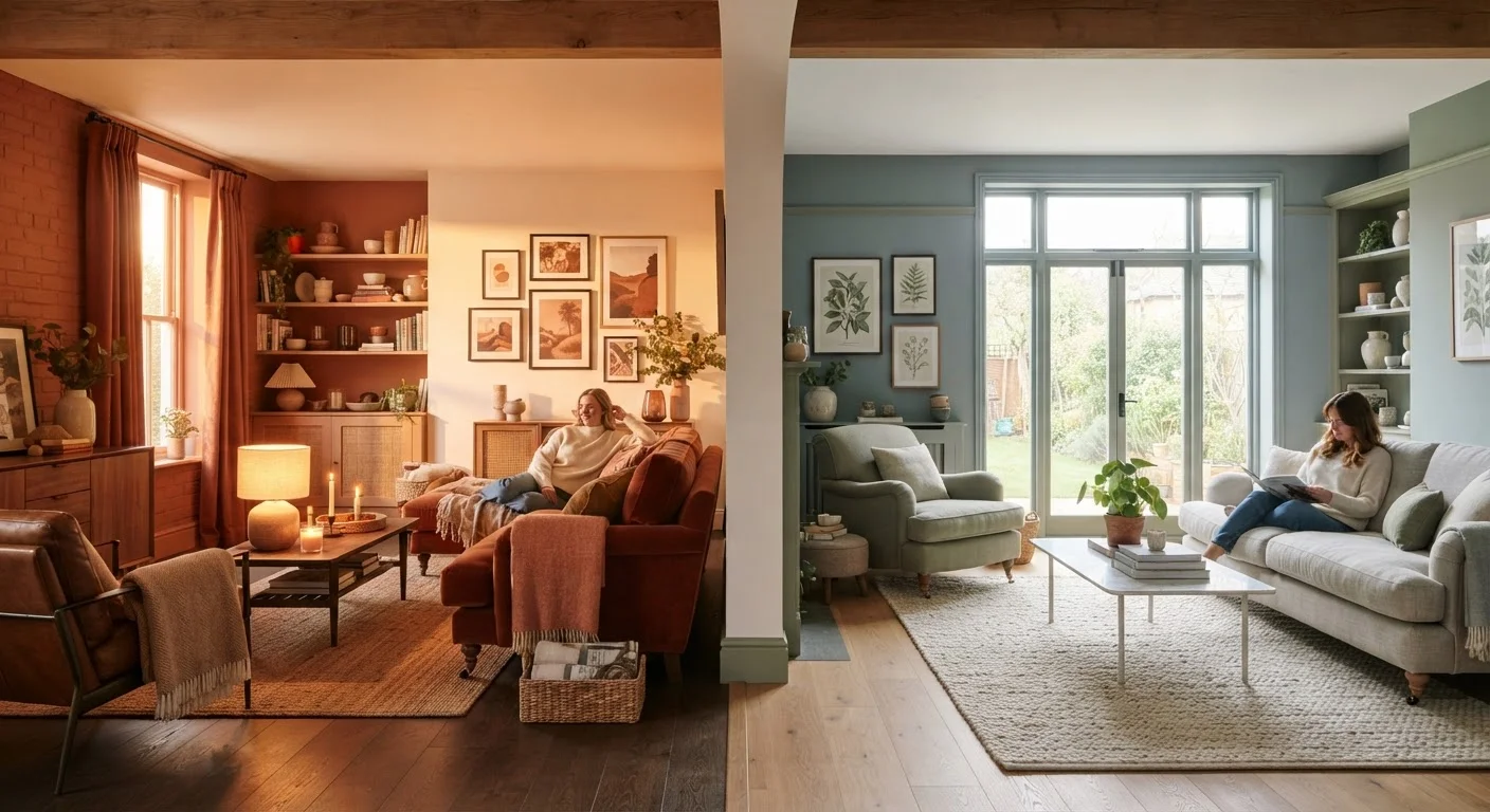
Neither warm nor cool palettes are universally superior — each creates a distinct psychological and spatial effect that suits certain rooms and lifestyles better than others. Warm palettes excel in social, cozy, or north-facing spaces, while cool palettes are ideal for rest, focus, or rooms with abundant natural light. The most livable interiors typically borrow from both.
| Best for | Recommended |
|---|---|
| Living rooms, dining rooms, and north-facing spaces | Warm Palette |
| Bedrooms, home offices, and south-facing rooms | Cool Palette |
| Open-plan spaces needing both energy and calm | Mixed (Warm + Cool) Palette |
What Color Temperature Actually Means
Color temperature in interior design refers to the psychological and visual warmth or coolness a hue conveys — not to be confused with the Kelvin rating of light bulbs, though the two concepts interact. Warm colors sit on the red-orange-yellow side of the color wheel. Cool colors occupy the blue-green-violet range. Neutrals like white, gray, and beige can lean either warm or cool depending on their undertones.
This distinction matters because color temperature directly influences how a room feels to occupy. Research in environmental psychology consistently points to color as a contributor to perceived room size, comfort level, and even time perception. Warm rooms can feel more stimulating and intimate; cool rooms tend to read as more restful and spacious. Understanding this before picking a paint chip can prevent the common experience of a room that looks fine on paper but feels wrong in person — a topic explored more deeply in our guide on common decorating missteps.
Warm Palettes: Energy, Intimacy, and Coziness
Warm colors — terracotta, ochre, rust, cream, deep red, burnished gold — tend to advance visually, meaning they appear to bring walls closer. This effect makes a large, echoing room feel grounded and human-scaled. In a dining room or living area where gathering and conversation are the goal, that sense of enclosure reads as welcoming rather than cramped.
Warm palettes are also particularly useful in rooms that receive limited or north-facing natural light. Cool daylight from a north-facing window can make a neutral or cool paint color feel stark or even dingy. A warm-toned wall absorbs that bluish light and returns it as something more golden and lively.
Test Your Paint in Context Before Committing
Paint a large swatch (at least 12 inches square) directly on your wall and observe it at different times of day — morning, midday, and evening under artificial light. The same paint chip can look dramatically different as light shifts throughout the day. This step costs very little but prevents expensive repaints caused by surprises that only emerge after a full room is done.
Keep in mind that warm colors can raise perceived energy levels in a space. For a bedroom, this is worth weighing carefully — a deeply saturated terracotta may feel too stimulating for restful sleep, even if it looks beautiful. Softer, more muted warm tones like blush, warm taupe, or dusty peach offer coziness without overstimulation.
Warm color temperature also appears in finishes beyond paint. Brass and bronze hardware, natural wood tones, rattan, and amber glass all carry warmth. Textile choices like wool rugs and linen curtains in earthy tones reinforce a warm palette without a single coat of paint.
Cool Palettes: Calm, Space, and Clarity
Cool colors — slate blue, sage green, lavender, soft teal, icy gray — visually recede, making walls appear farther away and rooms feel airier. This is why small bathrooms and compact home offices often benefit from cool-toned paint: the palette works with the architecture to suggest more space than actually exists.
Cool palettes also support mental states associated with focus and rest. Bedrooms painted in muted blue-greens or soft grays are a reliable choice precisely because they don't compete for attention. For a home office, a cool sage or slate can reduce visual fatigue during long work sessions.
| Warm Palette | Cool Palette | |
|---|---|---|
| Key hues | Red, orange, yellow, terracotta, gold | Blue, green, violet, slate, sage |
| Perceived room size | Walls advance — feels smaller, cozier | Walls recede — feels larger, airier |
| Psychological effect | Stimulating, energizing, intimate | Calming, focused, restful |
| Best room types | Living rooms, dining rooms, entryways | Bedrooms, bathrooms, home offices |
| Light compatibility | Ideal for north-facing or low-light rooms | Works well in bright, south/west-facing rooms |
| Risk to watch for | Can feel heavy or overstimulating if saturated | Can feel cold or sterile without warm accents |
South- and west-facing rooms that receive warm afternoon light often pair naturally with cool palettes, since the sunlight itself will shift the color temperature toward the warm end during peak hours. The result is a dynamic room that feels bright and warm in the afternoon, then settles into a cooler, calmer mood in the evening. For rooms where lighting plays a central role in the atmosphere, our article on layering ambient, task, and accent lighting explains how fixture choices interact with wall color.
Mixing Palettes: When One Temperature Isn't Enough
Most successful interiors don't commit entirely to one temperature. A room painted a cool blue-gray becomes far more livable when warm wood floors, amber-toned lamps, and soft textiles are introduced. Conversely, a warm terracotta room benefits from cool-white trim, stone accents, or greenery — houseplants are an underrated way to introduce cool, natural green tones into warm-dominant spaces.
A practical rule of thumb: choose one temperature as the dominant palette (roughly 60–70% of visual weight) and let the other serve as an accent. This prevents the visual tension that comes from equally competing warm and cool tones, which can make a room feel unsettled rather than dynamic. Open-plan spaces that flow between a kitchen, dining, and living area often benefit from a consistent dominant temperature across all three zones, with accents varying by function.
Color temperature thinking also extends beyond your home — if you're curious how the same warm-versus-cool logic applies to clothing choices, our piece on neutral vs. bold color strategies for your wardrobe applies similar principles to personal style.
The content on this site is for informational purposes only and is not a substitute for professional advice. Always consult a qualified professional for guidance specific to your situation.